The Social Change Nest (SCN) emerged in response to the challenges posed by a post-pandemic landscape, where even now conventional charities grapple with profound shifts and changes.

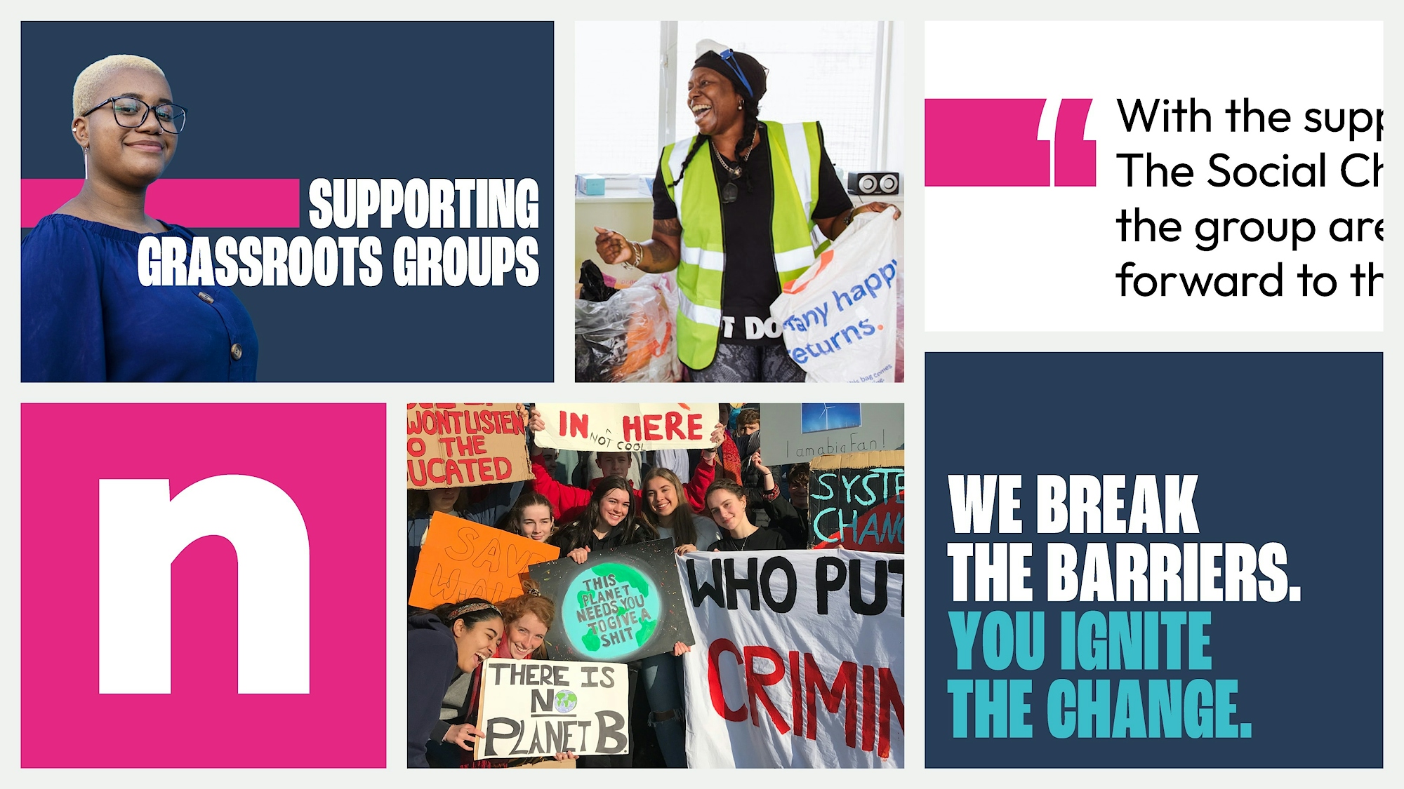
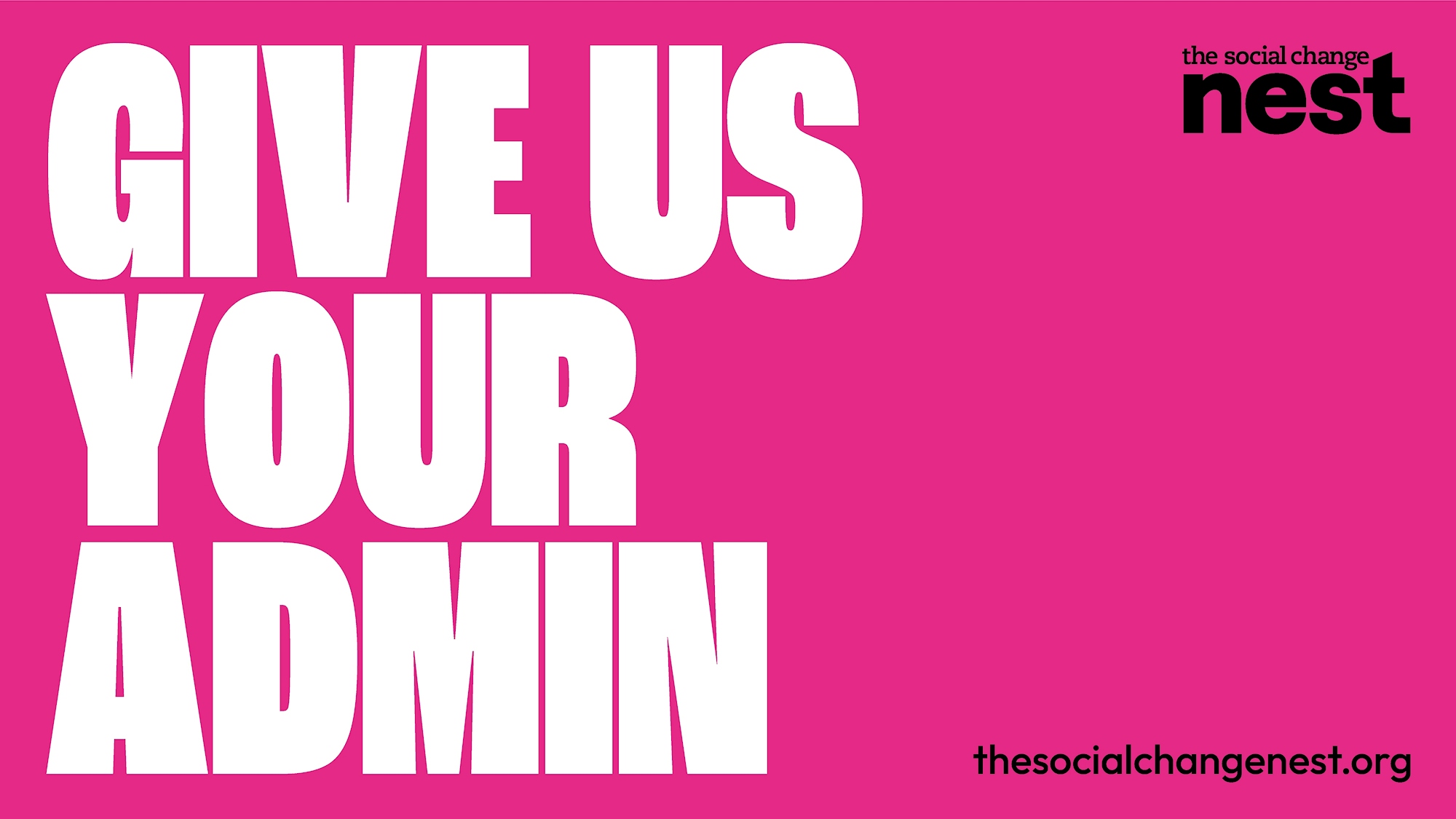
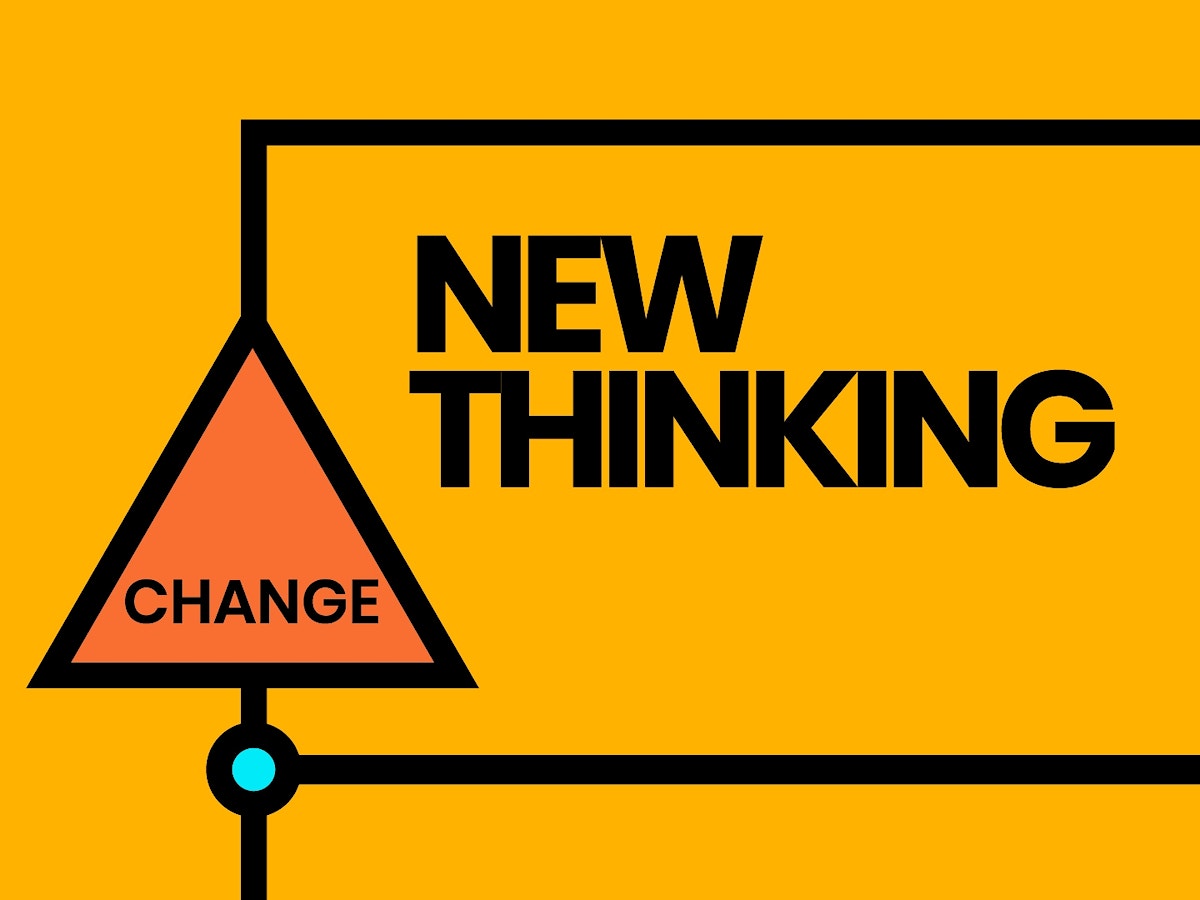
Not afraid to be radical, The Social Change Nest’s energy was infectious. We saw it across their innovative services and how they talked about the funders and groups they support. We learned quickly that the brand we created would need to match their energy.
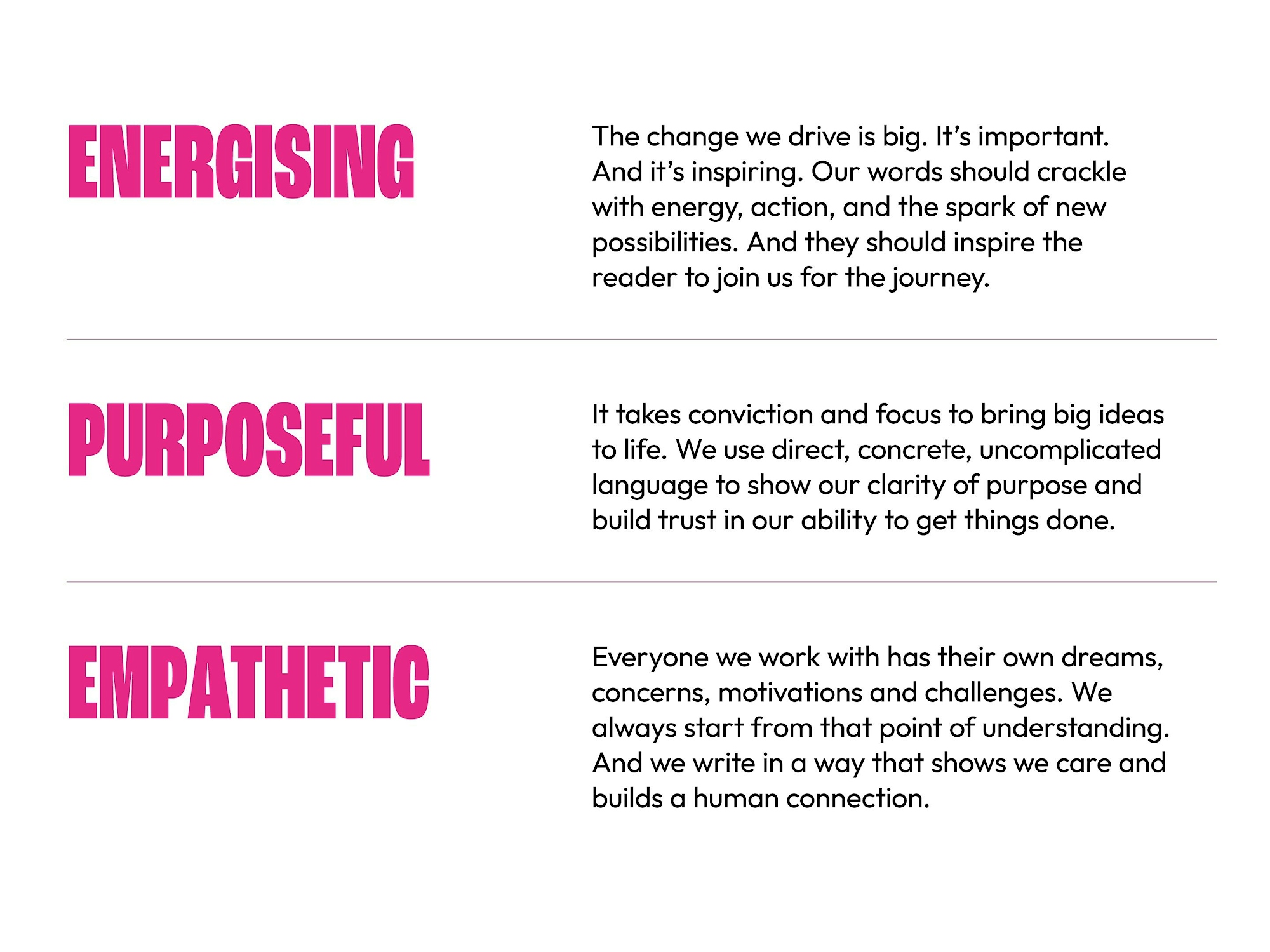
The new logo for The Social Change Nest

Logo design

We chose to separate the word nest and give it importance. The weight and size of the font make it feel concrete, providing stability for the text sitting above. The hero colour, Power Pink, immediately sets the tone and positions SCN apart from others in their space. The new logo acknowledges the sister organisation but ensures the two aren’t confused.

Designs showing applications of The Social Change Nest’s bold and accessible brand identity

Expressions of the bold but accessible brand identity.

Visual identity

A simple pink line becomes a powerful visual device. Representative of SCN, it moves and shifts things into the right place, a catalyst for change.

The headline font, set in all caps, echoes the simplicity and directness of typography seen on protest signs. Meanwhile, an uncomplicated font brings maturity and clarity to information.

Authentic and celebratory photography, sourced from their work to date, is used to bring colour and keep people at the forefront.

The new website for The Social Change Nest being used
A striking tote bag design for The Social Change Nest using the text ‘Here for the Changemakers’

Website design and development

Ever evolving to anticipate and shape the landscape, The Social Change Nest needed a website capable of keeping up with them. The design we created prioritises keeping information accessible while bringing in touches of SCN’s personality. Building the website included integration with Hubspot and creating a community resource hub.

Tone of voice

As well as reflecting their passion, SCN needed to clearly express their experience and expertise to knowledgeable funders and grassroots groups (who might be new to funding) alike. Copy that addressed both audiences had to strike a balance between the needs of these two distinct audiences.

Bold typographic poster with the words ‘Give us your admin’ set against a hot pink background
Section of the tone of voice guidelines created for The Social Change Nest

Tone of voice guidelines make it easier for anyone in the team to sound like The Social Change Nest.

Poster design for grassroots communities

Community resources making use of the verbal identity.

Expertise
  • Brand positioning
  • Tone of voice
  • Understanding & analysis
  • Brand guidelines
  • Brand identity
  • Logo design
  • Copywriting
  • Website design
  • Website development
  • Campaigns & marketing
  • Hosting & maintenance
Collaborators

Copywriting – Joe Jeffries